Thursday, 19 April 2012

What kind of media product might distribute your media product

Looking at media institutions i think that the kind that would produce my magazine would be Bauer Media Group or IPC Media. As these publication have been successful in producing and distributing magazines.
Bauer Verlagsgruppe logo2.png

IPC logo.jpg


Bauer Media group is known for distributing mainstream magazines like Kerrang and Q, and IPC Media currently distributes NME, these magazines are not only very successful magazines but they are also magazines that are based on the same genre as mine. so taking this into account I believe that either one of these institutions would be a good option to distribute my magazine because they have a lot of experience in distributing and handling magazines like mine. However this has positives and negatives, because even though they have experience, it may also mean that there is a a lot of competition in distribution of my genre as there are already a few successful rock magazines out there. I also think another reason why these institutions are a good choice is because the magazines that they distribute are aimed around the same age range as mine.


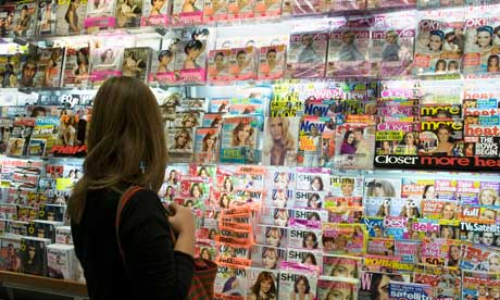
Most music magazines are distributed in newsagents and major stores such as W H Smith, Asda and Tesco's, and so I would mine to be distributed in these same places as they are the best selling place to appeal to my target audience. This way when they go out shopping they will be able to see my magazine and buy it Also I have noticed that the most popular and successful magazines are sold in news agents as they have a high demand for music, fashion and gossip magazines, so I would want mine to be sold there in order to become successful.

I would also like my magazine to be distributed via the Internet, I think this a is a good option as my magazine demographic is going to be older meaning the audience is older and more mature so they are more loyal customers. Using the Internet to distribute means the readers will be able to subscribe for the magazine every month. There will be an Internet presence on line however it won't be the full magazine  as this will influence sales, instead it can show the front cover, in order to get the readers interested.


Tuesday, 10 April 2012

Looking Back At You Preliminary Task, What Do You Feel You Have Learnt In The Progression From It To The Final Product?


By looking at both of my magazine covers i am able to compare them and i can see the progress i have made throughout the course. i have progressed by learning about different technology techniques that enhance the quality of productions. I have also learnt a lot about magazine conventions including the layout, colours, photos and text and how these factors can affect the quality of my work, and so when making my final magazine i new the typical tropes and i was able to use them in order to improve my magazine. The typical tropes is for subtitle sot go down the side of the cover, where as on my preliminary task I put them down the bottom which then does not make it look as professional and planned out. It hard to completely compare the two magazines as they are based on two different topics, however in general i can see that my final product look much more professional as it looks well planned out, on my prelim cover there are numerous mistakes because it was not preplanned and so these mistakes makes it look amatory and of poor quality. Overall I have learnt a lot from my prelim to my final cover on how i can make a good looking professional magazine cover if i use certain techniques, conventions and software.


By also comparing my contents page from my prelim task and final task i am able to see more development. I think that my prelim contents page looks boring and plain due to the lack of colour and layout used.Eben though when making my prelim contents page i thought that a more minimalistic look was better i can see now that i left it too minimal as it looks empty, which is boring and would not at all appeal to my target audience. On my fist attempt I used a simple text font thinking it made it look professional however it now looks simple, dull and that no effort was really put into it. My final one looks more full and interesting because the page is filled up but at the same time not really that cluttered, I have also used interesting and different fonts for different sections that have continued to be used from the front cover, whereas on my prelim i used one font for all of the text. Again my final contents page looks of higher quality as it looks more planned and professional.


When looking back i would say that i did not put as much effort into my prelim task as my final task, and this definatly shows through quality comparison. Also because i had not done any research of magazines when i made my prelim i was unsure at the time of how my school magazine should look to make it as good as possible. And so when i see my final pieces i can see my research payed off as i was able to take into consideration many different factors when making a magazine in order for it to look professional.


For my final product i was also able to make many changes in order to improve and correct an mistakes i may have made as i made three different versions of my magazine, each time improving making the quality better every time. However on my prelim i had one attempt and so could not ask my target audience what they like and dislike about it in between versions in order to improve.

Sunday, 8 April 2012

Evaluation

Now i have completed my main tasks, i will now start my evaluation of it.

Saturday, 7 April 2012

Magazine Final Piece

Here is my final Magazine cover, contents and DPS pages:

Front Cover

This is my final front cover. I decided to use a different picture to my 1st draft as i had difficulty keeping to the rule of thirds when all of the models were on different levels, and so i used a more simple picture where there is still a level change but it is not too drastic, this way i kept to the rule of thirds and was able to keep the picture and models central. This also then emphasised the direct address of the photo as they are all clearly looking at the camera with a 'moody' expression this is a trope of rock music and so the viewer can instantly see that this is not a light-hearted magazine. I called it 'Six Strings' in order to show the readers that this is a guitar based music magazine, as guitars has 'Six Strings'. The colour scheme is red white and blue, and when i got feedback on it, some said that it reminded them of Mod. Mod is a subculture that originated in London and had a Royal Air Force roundel which is a Mod symbol. Mod has been associated with many genres one being rock.

Contents Page

This is my final production of my contents page, i again decided to change to picture, i still stuck with the guitar theme, however i noticed that the problem with the previous picture was the part i took a photo of, so i decided to take a couple more photos of different parts of the guitar, that is how i came across this picture i decide to use this one as it not only gives of a music and rock vibe but it also fits in with the masthead on the front cover which is 'Six Strings' this way the magazine has more fluidity.

Double Page Spread


As you can see this is my final draft of my double page spread and i have made some slight changes, one being the picture, i found the previous one looked quite squashed on and it was hard to get everyone in the frame so i decided to go for this one where everyone is central., I then changed some of the positions of the text which made sure that no words were being cut of.

Thursday, 5 April 2012

Magazine 1st Draft

This is my 1st draft of my magazine front cover as you can see i have made a lot of changes from my mock-up. I asked my target market about the mock up page and they gave me feedback on what they liked and disliked about it, this way i could improve on it.

Front Cover

One major thing that the target market seemed to want to change was the background, on my mock up i cut out the background, to give a more simplistic look as i thought i would be able to make the business with the text, however the target market seemed to think that it was to plain, and so when i took my real pictures i also felt that they looked much better with it, when it was just plain white it did not give of the correct vibe being alternative rock as it was too plain and simple.

I have also changed the colour scheme as it goes much better with the picture i have used and this way you are able to see the text clearly. speaking of text i have moved ''The new voice of 2012 Toy soldiers'' and the quote because i felt that there was just an empty gap at the bottom and i wanted to fill, also seeing as the band is the main object of the magazine i felt it important that it stood out and did not fit in with all the other subtitles.

My target market like the picture as it had the band members on different levels i carried this idea through to my 1st draft but made it more dramatic, however one problem i had with it was trying to keep with the rule of thirds an so i have to make alteration to heights to make sure that they were still at different levels but also that the picture was central and no faces were being covered up.

Contents Page


As you can see i have made changes to my contents page aswell, the main change on this draft is the picture, on my mock up i felt that it was giving of a more acoustic impression rather than rock, but because i could not take a picture of an electric guitar due to the fact that i do not know anyne who ones one i decided i would just change to angle and effect of it.

My target market liked the idea of separaters, however i felt that there were too many so i decided to keep one separater, keeping the page items and the editors message separate. I also decided to chane the positions of the content items to fill up the page more.
Double Page Spread


Monday, 2 April 2012

Technology

I did most of my work on a Mac computer at the begining of the course, I used it mostly for blogging my school magazine and researching and posting about my genre. I found it difficult to work on this type of computer mainly due to the programs, as i was not used to it, so because of this i decided that it would be best to do my work on regular computers at school and my laptop at home.
Because of the difficultly with the macs, I used my laptop at home for most of the course, i reated all of my drafts on the laptop as I found the software more familiar and easier to use.

Publisher is the software I used in order to create my drafts for my magazine.
For my original school magazine I used pagees which is a program on the mac computer, I even through i managed to complete it i found it difficult to work with as i could only complete work on that same computer and was unable to take home to complete.


Google is the website that i ussed a lot in order to get my information for my magazine at the begining of my blog, it was really helpful, uick and easy to use.


Blogger is the website in which i used to post and record my information on the project, i was able to use this anywhere, on any computer which was proven handy and effective.


This is the camera i used for some of my drafts, i borrowed it from the art department, however because it was not always free i could not use it for every picture as the pictures i wanted to take were outside of school.
Picnik is the photoediting website i used to edit all of my pictures there was a variety of effects as the website is closing down soon so i was able to use the premium effects.


Saturday, 31 March 2012

Wednesday, 28 March 2012

Final Magazine Pictures

For these two pictures i think that they would work well on the double page spread as the band are spread further apart which would work well when stretching over the two pages.


I think that these two pictures would work better on the front cover as they are close together, and all in the centre of the frame.

Sunday, 25 March 2012

DPS Pictures

After taking many photos i choose a picture to use for my double page spread, i then had to try out different editing techniques, which are as followed:

This edit is called Boost, it brightens up the picture and emphasis's the colours.
This edit is called Lomo-ish, it blurs the edges which makes the reader focus more on the main point being the band. it also emphasises the colour slightly making them stand out.
This edit is called Cross process it changes the colour of the photo slightly giving it a more darker look, which fits in great with the genre rock and it is considered a dark genre.
This edit is called CinemaScope, which makes the picture lighter with a hint of brown making it look like an slightly aged photo. Which is very vintage.
I choose this picture because after doing some research i noticed that on double page spreads the artists seem to be spread out and many pictures seem to be taken within a natural area, and so i followed this convention when taking my photos.

Saturday, 24 March 2012

Risk Assessment

When taking pictures for magazines, a risk assessment must be carried out. All professional photographers carry out a risk assessment and so i did the same with the pictures i wish to take for my final magazine. Doing a rick assessment will limit the risks of something going wrong which means i will most likely have a successful and efficient photo shoot. With the location i have chosen, i must consider the risks involved when shooting on this location, then i will be able to decide how i want them to look and what i want to achieve. The risks with my location are as followed:

Risks
  1. Working outside-It may be cold
  2. Consent-I must make sure they are comfortable with me using the photos taken and putting them on my blog.
  3. Dropping props-When moving to different spots.
  4. Animals-The spot i have chosen is a popular place for people to take there pets and so there may be faeces on the ground. So someone could fall and stain the clothes.
  5. Rain-may effect equipment such as cameras or ground could be slippery so there is a chance of injury.
  6. Tripping on uneven ground- such as bridges or pavement.
  7. Small pathways-could fall into the water.
Solutions:
  1. Make sure that the models are warm or if there warm clothing does not match the look that i am going for, then there can take photos in clothes given and then when moving to different spots or between shots they are able to put on something warm while they wait.
  2. Explain to them beforehand the full terms of the photo shoot, and make sure that they are aware and happy with the arrangements.
  3. Be careful when moving props and if necessary carry one at a time or get someone to help.
  4. Examine the area before hand and make sure there is no faeces, if there is then warn the participants before hand.
  5. Make sure the correct footwear is worn or reschedule for another day when there is better weather.
  6. Look where you are going at all times and make sure that the participants are aware of the ground and are concentrating on where they are standing/walking.
  7. Make sure everyone is concentrating on the ground and not getting distracted.

Friday, 23 March 2012

Attracting Audience

When making any product you need to take into consideration the target audience and how you are going to appeal to them. So when creating my magazine target audience is vital, as the more it appeals to them the bigger the target audience which means a bigger income from the product. To appeal to my target audience i must take into account their interests and opinions this way they will be interested in the magazine.

New Artists
Many teens are interested in the new artists around and are keen to know what they are like, and so the fact that i am advertising new bands on my front cover is a an advantage to appeal to my target audience, to match this i will also be doing a double page spread on the new band with information and pictures and maybe even some tips for aspiring artists to help them to become successful themselves.

Reviews of albums and singles
I think that it is quite important to include this aspect because before anyone buys any sort of music we want to know whether its going to be worth it, and so reviewing music will make them depend on us for good reviews, also by doing this i will be advertising certain artists, making the genre more popular as a whole.
Concerts and festivals
Rock artists do tend to perform at many concerts and my target audience being late teens are usually very interested in live performances and so this is a massive appeal to them. I will include information such as previous reviews, line ups, ticket prices, dates and venues.

Rock Sub-genres
I will be including many different aspects of rock because some people may have one typical view of rock music and so i will be talking about different rock artists that come under different sub-genres, in order to show the differences within the rock genre. I believe that this will appeal more to the audience as there will be more variation in rock artists the rock artists that will appeal to more people.

Awards
In my magazine i think i will be mentioning things about the Brit awards, this can then involve a lot of information that will appeal to different people and therefore increasing target audience, for example it can include fashion, up 's and down's, who won and even give information about how to become successful like the stars.

Competition

Competitions within magazines makes it more interesting and allows the reader to become more involved. I think it is very important to have at least one competition section and so i will be including this in my magazine, the prize can be something like concert tickets or backstage passes, these kind of prizes instantly increase target audience appeal.

Free Promotional Gift

A lot of people like the idea of free gifts and it is another convention of magazines in general to include one. To fit in with my genre and to appeal to my target audience i could include things such as posters, t-shirts or vouchers for shops, i-tunes etc.

Thursday, 22 March 2012

Shooting Schedule

To prepare for my photo shoot for my final draft i made a shooting schedule, this way i am organised and know the order of events in order to get my pictures. After i take these pictures i will be using editing techniques for it to look more professional and fit in more with the genre. I want my photos to show the way the band stand out so instead of taking the pictures in a typical rock location like rural i will be taking them in a more nature location to really emphasise them.
  • Pick out the outfits for the band members that have a rock feel to them. (30 minutes)
  • For the female models, put on their makeup and style their hair. (20 minutes)
  • Leave to go to the location, which is the brook near my house (5 minutes)
  • Arrange the models on the bridge and find the correct angle to take the pictures. (10 minutes)
  • Take different pictures in different angles and different positions. (10 minutes)
  • Move around the brook to get different backgrounds. (30 minutes)


Wednesday, 21 March 2012

DPS Article

Here is my double page spread article, I have used these questions because i think that they address the main magazine title on the front cover, to answer these questions i have used informal language as i believe that this will engage more with the readers and keep them interested, i have also made it quite casual which is a typical trope of rock.

Toy soldiers, Even the name is powerful. They are the new voice of 2012 and have recently released there new single ''I Will Not Go'' which went straight to No. 1 in the charts. They have come to talk to Six Strings to tell us how there all feel about the recent events and a little in sight to there previous and present lives. So lets here what you new kids on the block are here to say.


What is it like to be known worldwide?
Alice: “Well it is quite surreal, and to be honest for me it hasn't quite sunk in, I am still quite shell-shocked that people are singing our songs and talking about us. In one way it is so exciting but in another it’s really scary.”
Rob: “It's Amazing, I love the fact that people are talking about us, good bad i don't particularly care, but the fact that we are known is enough for me, all the hard work has finally paid off. I mean not only are we known worldwide but we have officially been crowned the voice of 2012, which is crazy, it is such an Honor. And when that news came through i was gob-smacked, it's one thing for people to now you but another for them to actually like you."
Ryan: It is so weird, to me it kinda feels like i am in a dream or that its not really happening to us its just all in my head.
Rob:...We;re not in Cansses anymore Dorothy.(Rob and Ryan start laughing)

Now you have just released your new single "I Will Not Go", and it is at number one, it has been praised for it's deep meaningful lyrics, tell us about that.

Alice: Well we all contributed to making the song, we wanted our first ever single to represent us, so of course we wanted it to be meaningful not only to us but everyone else. We have said right from the beginning we want our music to help people and aspire many. That is our aim with this son as it encourages people to stand up for what they believe in and stay strong and not run away from problems, people or anything hence the name I will not go.

What’s the best aspect of being famous?

Jamie: “For me it’s the freebees” (turns to Ryan and they both giggle)
Ryan: “She loves her free bees, she always says to me if life gives you lemons, take them there free”
Jamie: “And meeting all the celebrities that I had (coughs "have") crushes on. It is just so strange meeting people that you are normally only able to see on your TV screens, and I get very nervous so when they talk to me I make an absolute idiot of myself.  Just last week at the Brit awards I met Noel Gallagher from Oasis and Beady Eye, I stood by him on the red carpet where he turned to me and said "You alright" It was such a simple little question and for some reason I could not answer him instead I just froze on the spot and let out a little squeal, like some obsessed teenage girl, I felt really embarrassed, but inside he did actually come up to me, saying things like it was OK to be nervous and ow you just have to take it on then chin, he kept making me laugh to take my mind of being nervous, he was my night in shining armour. So it was nice to know someone was in the same boat as me.
Ryan: “For me it has to be the performances, It is such an amazing buzz to be up on the stage in front of thousands of people who have paid money and come along to see you perform, I love it, it is so scary yet so exciting at the same time, it is like a very powerful adrenaline rush. Aside form that, yeah I do like the free bees, free bees are good.” (Gives a Cheeky smile)

What was the biggest struggle to getting where you are now?

Rob: "It's probably the music scouts, we did have many scouts come to our performances, and we would always get nervous when we knew they were coming to see us."
Jamie: "Because we are rock artists most people expect us to be confident and not get nervous, but we do and maybe in time the nerves will go but we have only just become famous so we have been telling each other that we are the exception and we are allowed to feel like this."
Ryan: "But saying that we have been told on many occasions that we look really confident and powerful on stage so as long as we carry on like that then i think we will be just fine."

How do you all know each other?
Alice: Well I know Rob from college, we were both studying sociology. When I moved from secondary school to college we were in the same class and we just hit it off, and became our own little social group.
Jamie: Well I moved over to Kettering half way through my college year, I was also studying sociology and so I was in the same class as these two (nods towards Rob and Alice) unfortunately (Jamie and Alice both start laughing) but for the first few months we did not really acknowledge each other until we were asked to do a pair project, and the pairs were picked by the teacher, so I was put with Alice, after that I started to hang around with them more often.
Ryan: …This is where I come in, I began dating Jamie, and when I was first introduced to her friends I did not get the warmest of welcomes from one particular band member (He looks over to Rob, who starts laughing) Rob did not trust me, and was acting like an older brother towards Jamie, I cant say I blamed him those three had been friends for just over 2 years. Alice was the one to sort us out, she literally knocked our heads together. No seriously in the hallway me and Rob were not speaking  at all and Alice got hold of our hair and pushed our heads together and said that if we did not sort this crap out, we would be in serious trouble.
Rob: Coming from Alice that is something to be feared so we had a male bonding session, where we went to this concert which Jamie and Alice had sorted out, so we had no idea who was going to be there. It was in fact my absolute favourite band, and as it turns out it was also Ryan’s, we both call that day the start of a wonderful bromance.

Have there been any major disagreements within the band?

All: YES! (All burst into fits of laughter)
Jamie: The band name was one of the biggest arguments we have ever had. We all had completely different ideas.
Alice: I wanted to be called barbed wire. because i thought it sounded edgy, but when i told them i thought of it when walking past a barbed wire fence they went of the idea. It took us absolutely ages the think of a name that we wanted to represent us, When most people think that us girls would be the picky ones t was actually the boys, there was no pleasing them. Finally we did come up with the name Toy Soldiers, we choose this name because we think it says a lot, the word 'Soldiers' shows the battles we had to overcome to get here and 'Toy' represents the fun we have also had together. Other than that there have not really been any other disagreements, we all get on really well and have the same sort of idea of what we want ad so other than the name, everything else has been a breeze."
Rob: "So Far."

Who has the most rock tantrums?

Alice and Jamie: ROB!
Alice: Yes defiantly rob, he is the biggest diva and drama queen i have ever meet. But it is what makes him absolutely hilarious, most of the time he does have tantrums that he purposely goes over the top with it. Then there are some times where he is deadly serious, and we just can not take him serious and we do tend to take the mick out of him, which winds him up even more. He just gets so annoyed, it is so funny.
Ryan: I am probably the one who provokes him a lot of the times to encourage these tantrums, we do tend to play a lot of pranks on each other, mine are better than his obviously, but my pranks are always taking him by surprise so he tends to become a right diva when he gets pranked.
Rob: Guys! i can't believe you are saying this i am not a drama queen....I am a drama KING!
(all burst into laughter) Ryan does seem to play some pretty hardcore pranks, but it is all just fun and games and i do like to be very dramatic so it is just a great opportunity to do that.

What would each of you want to do before you die?
Alice: i would want to do something that is weird. Probably jump and swim into a pool of cubed jelly or chocolate, just something that i would love to eat my way out of. (all laugh)
Rob: I would love to throw a party with fake alcohol and see how many people actually act drunk. i think it would be hilarious.

Tuesday, 20 March 2012

Inspiration Double Page Spread Pictures


I thought it would be a good idea for my magazine double page spread to do the same thing that i did for my front cove, and thats to look for some inspirational pictures to help me for my DPS picture. I was mostly looking at composition and editing techniques. So the photos above are the possible are the possible poses that my models might do.

Looking at all of these pictures i have noticed that the bands seem to be standing quite a lot to show power and dominance that is conveyed in there music and is the typical convention of rock. I have also noticed that the 2nd and 3rd pictures have backgrounds that do not at all fit with the genre and style of the band, which i have mentioned in a previous post i would like to have in my magazine because of the way it conveys them standing out and being bold. The majority of pictures use eye contact which is used to intrigue the audience into reading the article, so when taking my photos i will use direct mode of address. The lighting used in many of these pictures have high lighting to highlight the band making them stand out even more.