Thursday, 19 April 2012

What kind of media product might distribute your media product

Looking at media institutions i think that the kind that would produce my magazine would be Bauer Media Group or IPC Media. As these publication have been successful in producing and distributing magazines.
Bauer Verlagsgruppe logo2.png

IPC logo.jpg


Bauer Media group is known for distributing mainstream magazines like Kerrang and Q, and IPC Media currently distributes NME, these magazines are not only very successful magazines but they are also magazines that are based on the same genre as mine. so taking this into account I believe that either one of these institutions would be a good option to distribute my magazine because they have a lot of experience in distributing and handling magazines like mine. However this has positives and negatives, because even though they have experience, it may also mean that there is a a lot of competition in distribution of my genre as there are already a few successful rock magazines out there. I also think another reason why these institutions are a good choice is because the magazines that they distribute are aimed around the same age range as mine.
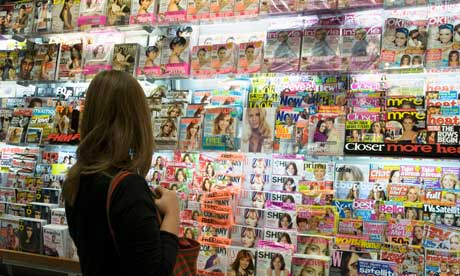


Most music magazines are distributed in newsagents and major stores such as W H Smith, Asda and Tesco's, and so I would mine to be distributed in these same places as they are the best selling place to appeal to my target audience. This way when they go out shopping they will be able to see my magazine and buy it Also I have noticed that the most popular and successful magazines are sold in news agents as they have a high demand for music, fashion and gossip magazines, so I would want mine to be sold there in order to become successful.

I would also like my magazine to be distributed via the Internet, I think this a is a good option as my magazine demographic is going to be older meaning the audience is older and more mature so they are more loyal customers. Using the Internet to distribute means the readers will be able to subscribe for the magazine every month. There will be an Internet presence on line however it won't be the full magazine  as this will influence sales, instead it can show the front cover, in order to get the readers interested.


Tuesday, 10 April 2012

Looking Back At You Preliminary Task, What Do You Feel You Have Learnt In The Progression From It To The Final Product?


By looking at both of my magazine covers i am able to compare them and i can see the progress i have made throughout the course. i have progressed by learning about different technology techniques that enhance the quality of productions. I have also learnt a lot about magazine conventions including the layout, colours, photos and text and how these factors can affect the quality of my work, and so when making my final magazine i new the typical tropes and i was able to use them in order to improve my magazine. The typical tropes is for subtitle sot go down the side of the cover, where as on my preliminary task I put them down the bottom which then does not make it look as professional and planned out. It hard to completely compare the two magazines as they are based on two different topics, however in general i can see that my final product look much more professional as it looks well planned out, on my prelim cover there are numerous mistakes because it was not preplanned and so these mistakes makes it look amatory and of poor quality. Overall I have learnt a lot from my prelim to my final cover on how i can make a good looking professional magazine cover if i use certain techniques, conventions and software.


By also comparing my contents page from my prelim task and final task i am able to see more development. I think that my prelim contents page looks boring and plain due to the lack of colour and layout used.Eben though when making my prelim contents page i thought that a more minimalistic look was better i can see now that i left it too minimal as it looks empty, which is boring and would not at all appeal to my target audience. On my fist attempt I used a simple text font thinking it made it look professional however it now looks simple, dull and that no effort was really put into it. My final one looks more full and interesting because the page is filled up but at the same time not really that cluttered, I have also used interesting and different fonts for different sections that have continued to be used from the front cover, whereas on my prelim i used one font for all of the text. Again my final contents page looks of higher quality as it looks more planned and professional.


When looking back i would say that i did not put as much effort into my prelim task as my final task, and this definatly shows through quality comparison. Also because i had not done any research of magazines when i made my prelim i was unsure at the time of how my school magazine should look to make it as good as possible. And so when i see my final pieces i can see my research payed off as i was able to take into consideration many different factors when making a magazine in order for it to look professional.


For my final product i was also able to make many changes in order to improve and correct an mistakes i may have made as i made three different versions of my magazine, each time improving making the quality better every time. However on my prelim i had one attempt and so could not ask my target audience what they like and dislike about it in between versions in order to improve.

Sunday, 8 April 2012

Evaluation

Now i have completed my main tasks, i will now start my evaluation of it.

Saturday, 7 April 2012

Magazine Final Piece

Here is my final Magazine cover, contents and DPS pages:

Front Cover

This is my final front cover. I decided to use a different picture to my 1st draft as i had difficulty keeping to the rule of thirds when all of the models were on different levels, and so i used a more simple picture where there is still a level change but it is not too drastic, this way i kept to the rule of thirds and was able to keep the picture and models central. This also then emphasised the direct address of the photo as they are all clearly looking at the camera with a 'moody' expression this is a trope of rock music and so the viewer can instantly see that this is not a light-hearted magazine. I called it 'Six Strings' in order to show the readers that this is a guitar based music magazine, as guitars has 'Six Strings'. The colour scheme is red white and blue, and when i got feedback on it, some said that it reminded them of Mod. Mod is a subculture that originated in London and had a Royal Air Force roundel which is a Mod symbol. Mod has been associated with many genres one being rock.

Contents Page

This is my final production of my contents page, i again decided to change to picture, i still stuck with the guitar theme, however i noticed that the problem with the previous picture was the part i took a photo of, so i decided to take a couple more photos of different parts of the guitar, that is how i came across this picture i decide to use this one as it not only gives of a music and rock vibe but it also fits in with the masthead on the front cover which is 'Six Strings' this way the magazine has more fluidity.

Double Page Spread


As you can see this is my final draft of my double page spread and i have made some slight changes, one being the picture, i found the previous one looked quite squashed on and it was hard to get everyone in the frame so i decided to go for this one where everyone is central., I then changed some of the positions of the text which made sure that no words were being cut of.

Thursday, 5 April 2012

Magazine 1st Draft

This is my 1st draft of my magazine front cover as you can see i have made a lot of changes from my mock-up. I asked my target market about the mock up page and they gave me feedback on what they liked and disliked about it, this way i could improve on it.

Front Cover

One major thing that the target market seemed to want to change was the background, on my mock up i cut out the background, to give a more simplistic look as i thought i would be able to make the business with the text, however the target market seemed to think that it was to plain, and so when i took my real pictures i also felt that they looked much better with it, when it was just plain white it did not give of the correct vibe being alternative rock as it was too plain and simple.

I have also changed the colour scheme as it goes much better with the picture i have used and this way you are able to see the text clearly. speaking of text i have moved ''The new voice of 2012 Toy soldiers'' and the quote because i felt that there was just an empty gap at the bottom and i wanted to fill, also seeing as the band is the main object of the magazine i felt it important that it stood out and did not fit in with all the other subtitles.

My target market like the picture as it had the band members on different levels i carried this idea through to my 1st draft but made it more dramatic, however one problem i had with it was trying to keep with the rule of thirds an so i have to make alteration to heights to make sure that they were still at different levels but also that the picture was central and no faces were being covered up.

Contents Page


As you can see i have made changes to my contents page aswell, the main change on this draft is the picture, on my mock up i felt that it was giving of a more acoustic impression rather than rock, but because i could not take a picture of an electric guitar due to the fact that i do not know anyne who ones one i decided i would just change to angle and effect of it.

My target market liked the idea of separaters, however i felt that there were too many so i decided to keep one separater, keeping the page items and the editors message separate. I also decided to chane the positions of the content items to fill up the page more.
Double Page Spread


Monday, 2 April 2012

Technology

I did most of my work on a Mac computer at the begining of the course, I used it mostly for blogging my school magazine and researching and posting about my genre. I found it difficult to work on this type of computer mainly due to the programs, as i was not used to it, so because of this i decided that it would be best to do my work on regular computers at school and my laptop at home.
Because of the difficultly with the macs, I used my laptop at home for most of the course, i reated all of my drafts on the laptop as I found the software more familiar and easier to use.

Publisher is the software I used in order to create my drafts for my magazine.
For my original school magazine I used pagees which is a program on the mac computer, I even through i managed to complete it i found it difficult to work with as i could only complete work on that same computer and was unable to take home to complete.


Google is the website that i ussed a lot in order to get my information for my magazine at the begining of my blog, it was really helpful, uick and easy to use.


Blogger is the website in which i used to post and record my information on the project, i was able to use this anywhere, on any computer which was proven handy and effective.


This is the camera i used for some of my drafts, i borrowed it from the art department, however because it was not always free i could not use it for every picture as the pictures i wanted to take were outside of school.
Picnik is the photoediting website i used to edit all of my pictures there was a variety of effects as the website is closing down soon so i was able to use the premium effects.